How a kitchen explains where I'm from
A self-directed study in US residential standards — and the case for what a Brazilian eye brings to an American problem.
This kitchen does not exist.
I designed it for myself, as a portfolio piece, drawn to American residential standards — 381 square feet, dimensions in feet and inches, AFF callouts, fixture brands available on the US market. The drawing set is real. The materials are specified. The lighting is calculated. The room could be built tomorrow.
What it does not have is a client.
I want to start there because the honesty matters. There is a tradition of self-directed studies in our field — Vincent Van Duysen’s exhibition rooms, Tadao Ando’s Casa Wabi, the early conceptual work of John Pawson — and they tend to do something a paid commission cannot. They state a position. They show what the designer would do without compromise, on a problem of their own choosing.
So this is the position I am stating: what a Brazilian eye trained in our school brings to an American residential problem is not a different aesthetic. It is a different center of gravity.
The rest of this note is a walk through how that center of gravity shapes the room.
The decision that organized everything
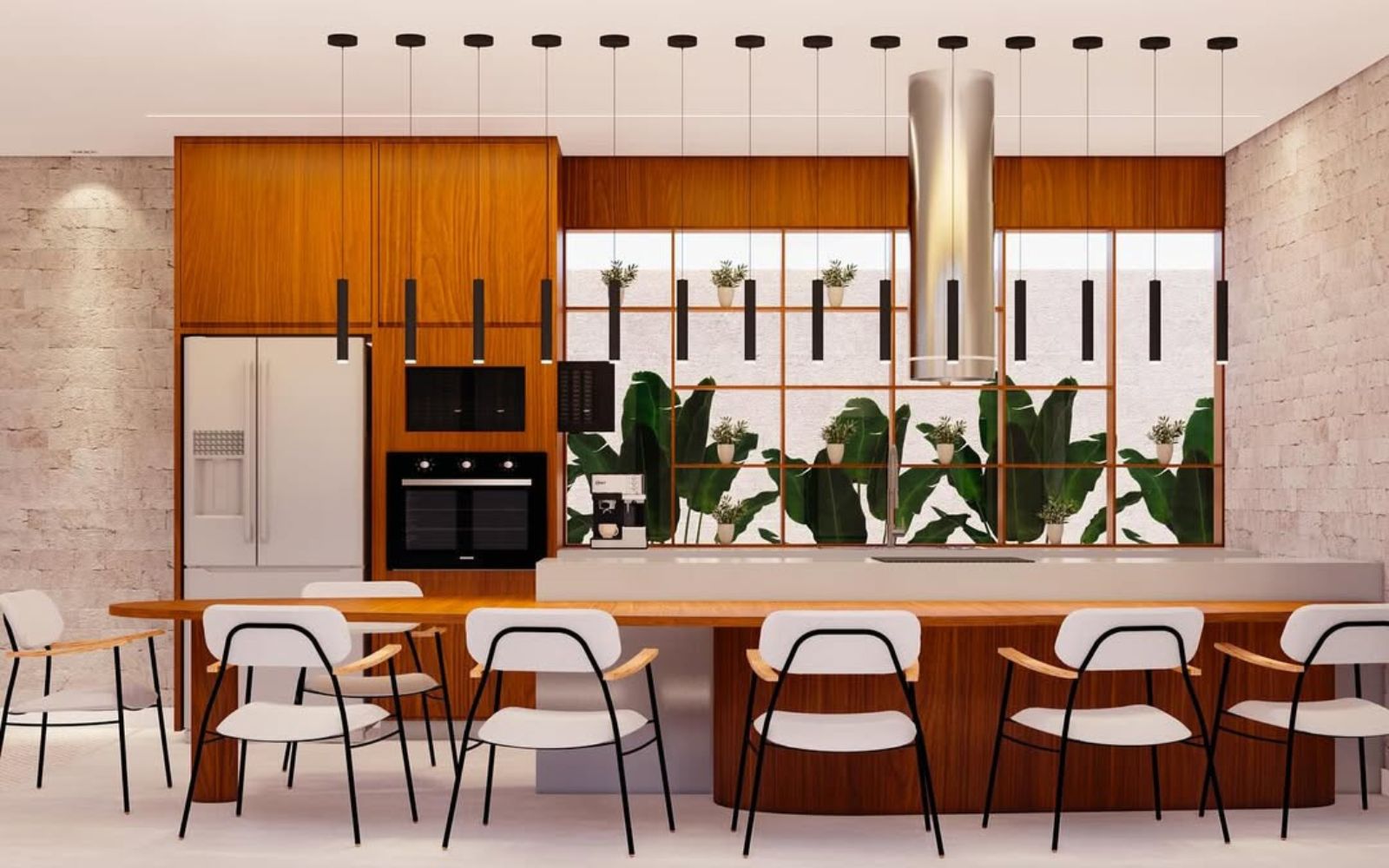
Before I chose a single material, I made a decision about a window.
A long horizontal opening behind the island, framing a Ravenala palm I placed in the exterior space beyond it. The window was sized and placed to make the foliage a constant peripheral presence at the dining counter. Everything downstream — the layout, the materials, the lighting — was subordinated to that view.
I do not believe Americans typically design kitchens this way. The dominant residential logic in US high-end work organizes the kitchen around the island, the appliance package, and the entertaining flow. Light enters where light enters. The exterior, when it shows up, is treated as an asset of the lot, not a participant in the room.
What I learned in our school — the school of Arthur Casas, MK Studio, the late tropical modernists — is the opposite. The exterior is the first material. You design the room around what the room sees. You shape the volume to accept light and you place the openings to frame the green. The kitchen is not a culinary machine that happens to have a window. It is a position from which the inhabitant looks at a plant.
That is the shift in center of gravity. Everything else in this study is consequence.
The Ravenala is not decoration
I want to be precise about one thing.
I chose this species deliberately. The Ravenala — Ravenala madagascariensis, the traveler’s palm — has an architectural geometry that few plants in the tropical and subtropical canon can match. The leaves fan in a single plane, often oriented along an east-west axis, and they read as architecture before they read as foliage. From inside the kitchen, framed by the horizontal window, the plant becomes a green wall with structure. It carries the room.
This was not a styling decision. It was a positioning decision. I placed a Ravenala in the exterior space because I wanted the kitchen to admit, structurally, that its primary visual relationship is with a tropical plant of a specific kind — fan-leaved, oriented, architectural.
You can build this kitchen in Florida. You can build it in Southern California. You can build it in any temperate or tropical American climate where a Ravenala will hold. The point is not that any plant will do — the point is that the right plant, intentionally chosen, becomes the room’s organizing view. American interior photography rarely shows kitchens designed this way. The room becomes legible the moment you understand what it is looking at.
This is what I mean when I say a Brazilian eye brings something American work tends to under-respect. We were trained to consider the green before the floor plan, and to choose the green like a material.
On biophilia, briefly
Biophilic design is one of the most misused terms in contemporary interiors. It has come to mean a living wall in a corporate lobby, or a planter on a kitchen counter as set dressing.
The older meaning is harder and more interesting. It is the recognition that we are still, at root, bodies that respond to natural materials, to texture, to imperfection, to the presence of something that grew. A room that admits this in its bones — not its accessories — settles the nervous system in a way the body registers without naming.
The materials in this study were chosen against the lazy version of the term and toward the older one.
Rustic limestone on the feature wall, in a brick-pattern installation, with the raw quarried texture preserved. The kind of surface where you can read the geology of the stone. American Black Walnut millwork in matte lacquer — dense, warm, the wood the eye reads as protection. Light gray quartz countertop with a 45-degree chamfered edge, to keep the lines clean against everything else. Off-white plaster on the ceiling, for diffuse reflection that softens the daylight.
No moss wall. No counter-top herb garden as styling. The biophilia is in the limestone’s chip and the walnut’s open grain, and in the Ravenala the room was built to look at.
The lighting layer — the kitchen as a tool with modes
A kitchen at seven in the morning has nothing in common with a kitchen at nine at night, and the lighting plan has to know that.
Two layers carry the room.
A recessed linear LED running 18 inches off the wall, 3000K, CRI 90+, dimmable — Tech Lighting Unilume. This is the working light. It washes the wall, fills the prep zones, and disappears into the ceiling. At full output, you can clean fish on the counter and see what you are doing.
Above the island, a row of Visual Comfort Blok pendants, bottoms set at 5’-6” AFF — low enough to read as decorative punctuation, high enough that they do not crowd the table. Run them dim while the wall light goes dark, and the same kitchen becomes a place to open a bottle of wine after dinner.
Two layers, dimmed independently. The kitchen has more states than any of its individual fixtures suggest.
What this study is for
I started this note by saying the kitchen does not exist. I want to end by saying what it is meant to do.
It is a portfolio piece. It exists so that an American studio considering hiring me — for residential, for lighting, for high-end interior work — can see a complete, US-standard project that demonstrates a specific thing: a designer trained in another school, fluent in the technical and dimensional vocabulary of the American market, bringing a center of gravity that vocabulary does not natively carry.
If that combination is useful to you, I would like to hear about your project. Write to me.